Stranded Vader
"Having crash-landed into a sand dune, Lord Vader is faced with roaming the length of the desert in search of an oasis and somewhere to contact for a route off-planet".
The character has a secondary design influence from the post-apocalypse of Mad Max. I liked the punk look and survivalist setting, and I thought mixing that with the sterile, imperialist aesthetic would make a striking design.
[Part of the assignment Gam370]
Final Render:
Below is my asset development process in depth
Concepting & Sculpting the Blockout Base Figure
The decision to create a character based on Darth Vader was a spontaneous decision sparked by a conversation with a friend. I wanted to explore the concept of Vader as it's something that intrigued me as it would challenge my skills to make hard-surface models, in addition to soft, flowing fabric as part of one character. The variety in materials would test my ability to create a variety of textures, surfaces and form -- a great expression of technical skill.
Upon doing independent research, Game studios such as LucasArts, EA Games, Respawn Entertainment and Motive Studios have made high-profile, AAA Star Wars games that I have played and enjoyed, with a recent highlight being Respawn's Jedi: Fallen Order. As a fan of the franchise and universe I personally would love to work on one of these projects, so I thought Vader would be a good foundation, but I still need to develop my vision of Vader to make it my own. At the time, I planned on making a straight forward depiction of Vader as I had no other idea yet.
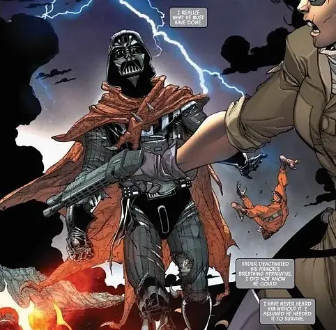
Upon receiving feedback from my teacher, I was told that doing a straight interpretation of Darth Vader would make it harder for me to stand out, and I could not refute Michael Boylan's reasoning. While the project can showcase my technical proficiency, the complete saturation of models of Vader in particular could burry my model in search results, and secondly could make it less eye-catching. Moreover, if I don't make an original design it makes it easier to suspect plagiarism. Thus, I ultimately agreed with my tutor that I needed to come up with an original idea.
Browsing Pinterest, I happened across this comic panel of Vader in a tattered cape, utterly dishevelled. It immediately struck my imagination. The first thing I thought was, "what if I did a mash-up between Mad Max and Star Wars?".

I focused my research on a few things. Firstly, Vader for reference, so I understand how the base design looks and why it works as an intimidating image. Second, I was looking for battle-scarred Vader references specifically - my research leads me to references of Anakin's arm he had replaced in Episode 2. Perhaps it would be cool if his clothes were tattered with his machinery exposed. Thirdly and last of all, I wanted a handful of references of attire found in Mad Max, so I can mix and match the concepts together faithfully, in a novel way that works.
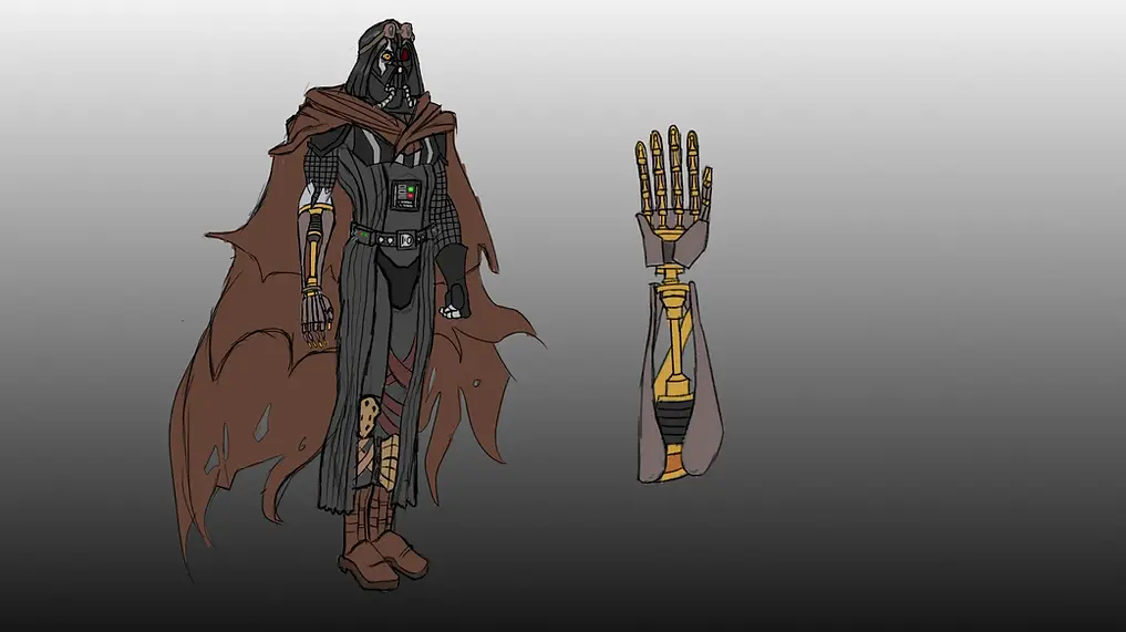
I lost my initial concept -- a mistake I made from my own poor file management during my studies, so I'm already faced with a setback before the project could start properly. On the bright side, I had the initial concept fresh in memory, so I started a second attempt. On the second concept sketch, restarting a couple improvements, like the stylization looking more distinct, as well as the silhouette working better since the figures taller and sharper.
About my final concept, I was married to the idea of having Vader's robotic arm exposed. I loved the asymmetry -- it's a big seller of battle-tear. I wanted to make this part of the concept so badly because I wanted to make polished, hard surface models, and Vader's arm is quite elegant, an organic shape forged in glistening machinery. It conveys his strength but also the loss of his humanity, figuratively and literally. Tearing his mask and exposing his eye is also something I liked; one half of his face shows his rage, while the other half is cold and calculating -- unreadable. Destroying it shows his vulnerability and his desperation to survive.
Other elements like the boots take a slight punk influence from Mad Max, but moreover the various straps, knee pads and goggles shows how his current outfit is strewn together with the fleeting materials he has at his disposal. Lastly, the cape is simple but striking, tattered but protective.

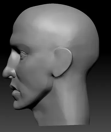
Starting off, I began blocking out the head. My intention was to convey a sense of realism, considering I want to demonstrate my technical ability. I'm not saying stylized models lack technical skill, it's more that stylization makes your mind fill in the gaps for what something is "supposed" to look like, so if something is lacking you might overlook technical errors to a small degree. When aiming for realism, there's no process of abstraction, so it's a bit clearer when something looks uncanny or "wrong". Moreover, my texturing style borders on realism and a lot of procedural textures -- I found if I used realistic textures on a stylized model it created a sense of dissonance.
Regarding the process, I started off using the tool Sculptris Pro in Zbrush for the blockout. In about a 2-hour period, I came up with this result. My focus was on the lips, and you could probably tell; from recent critique, I started studying their shape in detail because I had not focused on this element in previous projects and I wanted to push my understanding of anatomy. Lips can be abstracted to have 3 prominent spherical shapes in the centre, which forms a little v-shape put together. I was cutting out the muscles surrounding the mouth, which makes the lips stick out further.
Overall, not a bad start for me. While elements like the eyes and ears could be better, as well as the nose needing more definition, I like the strong shape of the jaw, mouth and the side profile. I need to work on the front profile for longer.
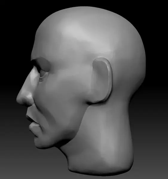
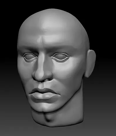
For my second pass at sculpting, I developed problem areas I skimmed over in the initial blockout. In anatomical terms, I realized I made the ear WAY too large along the bottom lobe. The rest of the changes were more subtle - sharpening the transition between the neck and the jawline, smoothing the creases under the cheek bones, defining the nose, defining the mouth. Now, I opted not to sculpt the ears, considering when I put him in a helmet, the ears should be hard to make out, so those blocky shapes in their place just so I could get the rest of the proportions correct.

Blocking out the body, I started using tools like clay build-up, Hpolish, the move gizmo with masking, just the basics. At this stage in production it's less about making something quality, and more about making abstract shapes to lay indicating markers where detail is supposed to go later. I did sculpt out the stomach, for instance, primarily because it made it easier to tell where the centre of the figure was.
After the torso, I dragged out the limbs, roughly scaled them into a rough shape. To make it easier to judge the proportions of the limbs, I took my head and I copy-pasted it 8 times for scale reference. With that I adjusted the length of limbs and slightly made the body slightly taller in proportion to the head.
I used dam standard to cut out the pelvis from the legs -- I thought distinguishing the limbs at this early stage will make it easier to discern troubles with my proportion and scale.

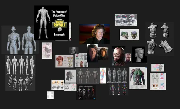
In the next pass, the primary goal was to sculpt a hand. I decided my character should maintain a more natural, relaxed A-pose, considering muscle definition shows more prominently in other areas while some spots are more relaxed. A neutral pose assumes nothing is flexing too hard, so I can use references with figures that aren't outstretched -- which I was having a more difficult time looking for. The more natural poses are most of what I could find, so I found it easier to replicate a similar base pose.
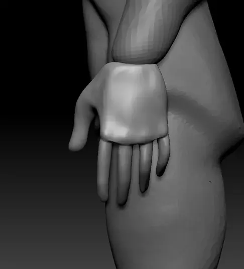
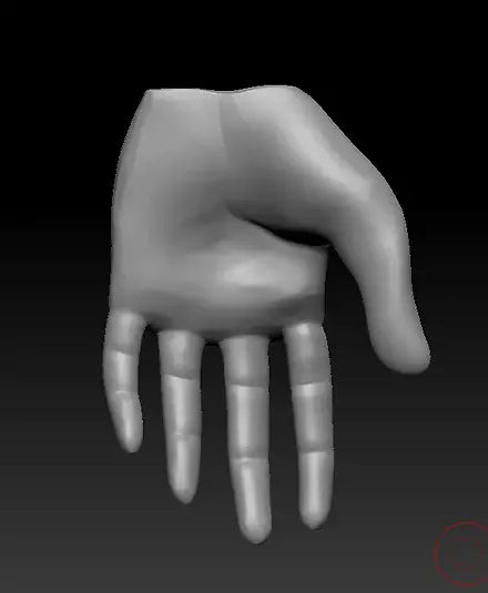
The main focus at this phase is the hand. Considering the pose itself is in a relaxed pose, I modelled the fingers in a curled, resting pose that fits the rest of the figure's posture.
To go about modelling this shape, I made the palm using a sphere I dragged and shaped around with the basic tools, namely Hpolish to carve away until the shape is sharp and defined in terms of its form. The edges along the inside of the palm, the knuckles and the inside of the fingers were gently cut with the dam standard tool to give them a bit of a defined edge.
Currently, the hand is looking soft, but even in its current state it makes the proportion of the arms less nebulous. I wanted the hand in at this stage for a visual marker for the body.
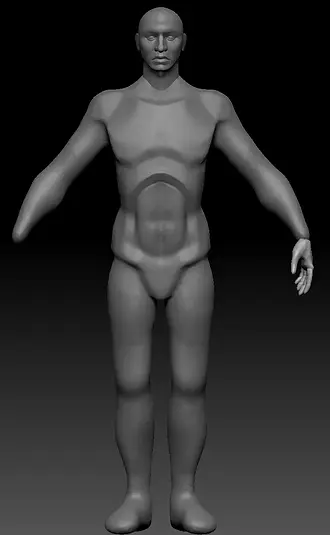
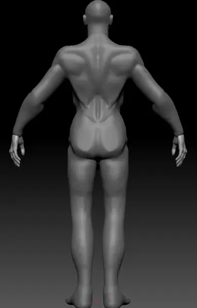
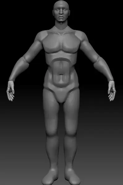
This is the second pass at proportions, and already I feel like I came a fairly long way already. I am trying to make the base figure anatomically accurate, and it's not an arbitrary decision. While my intention later is to cover the figure in robes and armour, the base figure is still important considering I always use the base figure to extract armour pieces or clothing that is form-fitting. As to why it matters with more obscured areas like the back with the cloak on, the plan is to use simulation which needs a base with proper form to work. I could use a generic base, but that would also take a lot of work to push around to fitting my special character. From my view I either put in the work now, or It'll need to come later, so I thought to start off early.
My goal for this pass was anatomical correction and general refinement of the body. In order to do that, I made aggressive use of Polish and Dam Standard; I cut stylized landmark cuts into areas like around the shoulders, underneath the pectorals, around the ribs, stomach, and the shoulder blades. Looking at it in this state, I think the latissimus dorsi isn't connecting to the back like it should, and how the ribcage cane be seen poking out from the back looks wrong. I believe my issue stems in my weaker understanding of anatomy from behind, and especially around where the rib muscles intersect with the muscles around the back, I have trouble making sense of it -- discerning what are superficial muscles and what are structural. I did my best to find references, but I honestly am not sure what I am supposed to research to learn more about that area underneath the arms. Also, the waist placement appears very slightly skewed too high.
The legs aren't yet developed, the glutes lack definition, but I did make time to pull them in a bit, making them a little more narrow while making sure the pelvis bone is still prominently visible above the legs.
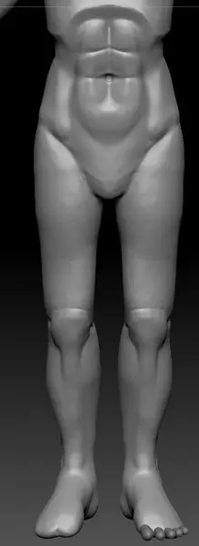
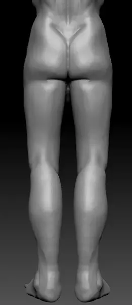
Pass 3 is focused on developing the legs. I'm still just using the basics at this stage; clay build up to add form to the knees, and using dam standard to cut out anatomical features like the glutes, the abs and stomach.
I decided I wanted to make the toes for a change. In previous artwork, I always felt like my feet were just the wrong proportions, but it was even harder to judge with the feet being replaced with a large stump. Moreover, as it's something I've not tried before, I did it in part because I wanted to test myself. I made paws before, I made some simplistic feet, but those never looked right to me considering the little toe appendages were sculpted on. I find it impossible to draw such small digits using dam standard and claybuild up -- the toes kept blurring together. Instead, here the digits are subtools which makes them easier to stand apart.

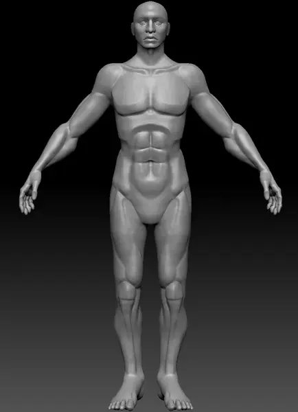
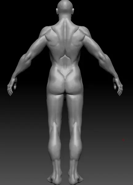
This is the final pass on the body. I made some large changes, but I also made some small, notable refinements that bring the figure together better.
As I mentioned earlier, the ribs bothered me as they poked out too much from the back side so I curved them, it made the silhouette read significantly better. I have completely changed the shoulder blades and the muscles around the neck.
The most technical part of the process was merging the subtools together. Dynamesh typically works, but it loses a lot of detail. It is possible to project history to make it sharper and to match the original, but the problem I have is that it's topology dependant, and Dynamesh topology that's projected can create some jagged edges.


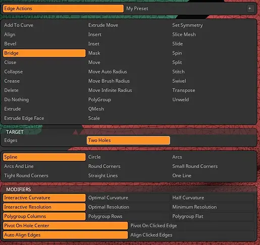
To merge the subtools I would start with the basic merging subtool > merge > merge down so I can start editing them together. I masked the edges, of the subtools and deleted them. Then, with a small gap between them, I use Zmodeler to use the function bridge which joins the two together. The one downside is the slight loss of detail around the seams -- it makes a jagged spline that requires clean-up. Personally I just use sculptris pro to smooth it out which is fast. This method I don't have to worry about clean topology yet, I'm purely focused on making sharp form with the need for layers or small surface detail. At this point, the model moves from a blockout to a solid foundation to build on.